 |
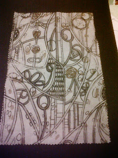
| For this samples I dyed the fabric using a reddy- brown dye. I liked the brown pigment against the dye but it didn't match well to the hanging sample. |
Thursday, 31 January 2013
Prints on Cotton Velvet
Prints on Cotton
 |
| This was the first sample i produced and was really happy with the outcome. I was really happy the screens finally worked having had to have them re-exposed. I also really liked the pigments i used. |
 |
| This sample worked a lot better lining up but I prefer the other. |
 |
| I really liked this sample, although it is a bit busy. I would have liked to repeat this without as many screens. |
Prints
 |
| This sample is on Habotai Silk with all five screens. I liked this sample but I think using all five screens was too heavy for the light weight material. |
 |
| These three sample are on Heavy Viscose Satin and are my favourite of all my samples. The print works really well on these and I would have liked to use this as the chosen fabric. |
Devore
 |
| This sample worked not as well as I would have liked, and decided to use only two screens over the top of the devore. |
 |
| This is my favourite devore sample. The screens lined up well and the colours worked well with the white background. |
 |
| This is my least favourite of all the samples. for some reason the pigments wouldn't take to the fabric properly and the dye turned out horribly. |
Puff Binder
 |
| The pufff binder didn't work as well on this sample though |
 |
| These two samples were done together, to enable that I had a sample lined up and another off set, but in the end i preferred the off set effect and did this to both samples. |
 |
| This was a sample using only screen three and five with puff binder onto the hanging sample. I did this to make sure my colours worked and really liked this sample. |
 |
| This is probably my least favourite puff binder sample as it didn't seem to work right on top of pigment. |
 |
| This sample was done using screens one, two and three and screen five is puff binder. |
Furniture
 |
| The armchair we are designing fabric for, is very similar to the one above. The wood in the room will be a cherry wood. |
 |
| The table and chairs Alison is having made for the dinning room will be similar to these above. |
Live Brief Time!
I have been such as busy bee during this project and haven't had as much time to blog as much as I would have liked. For this project we are working with a live brief, which means working with clients who work with in either the fashion industry or interior design industry.
Our tutor set up meetings with two clients and after listening to the brief of each one, we then had to choose either the fashion based brief or the interior based brief. The chance of working with either client would have been a great experience, but I believed the best brief for me would be the interior design brief. For this project we are working with interior designer Alison Cooper. Our client is Mr. Jonathan Walker-Kane, a barrister with a home in Thurlstone, Sheffield.
The room Alison is re-creating, is a Victorian styled dinning room, in which the interior is totally wrong, as the house was built in the Arts and Crafts era. Alison has a table and chairs been made similar to ones designed by Charles Rennie Mackintosh. The room's colour scheme is to be very pale grey and the drapes are a light weight silk in pale grey and oyster.
Our task is to research into Charles Rennie Mackintosh, as well as other Arts and Crafts artists. From this we are to take inspiration and create our own design to be printed onto a fabric which will then feature on a armchair Alison is having made for the dinning room. The winning design will be used for this armchair.
Subscribe to:
Comments (Atom)


